Intro to Project
Sutoscience is the personal company of a professional ghostwriter and copywriter. The client was looking for a designer to create a logo design & brand guide she could use to market herself on social media and website.
In her creative brief, the client explained the significance of Sutosciene as the combination of her last name and “science” which she felt characterized her method-based approach to creative writing projects. The client envisioned combining traditional visual icons such as vials, beakers, and test tubes with artistic flourishes to attract fellow freelancers and artists to her services. With this in mind, I wanted to define sutoscience’s visual identity as the science of bringing an artistic vision to life.
Composition
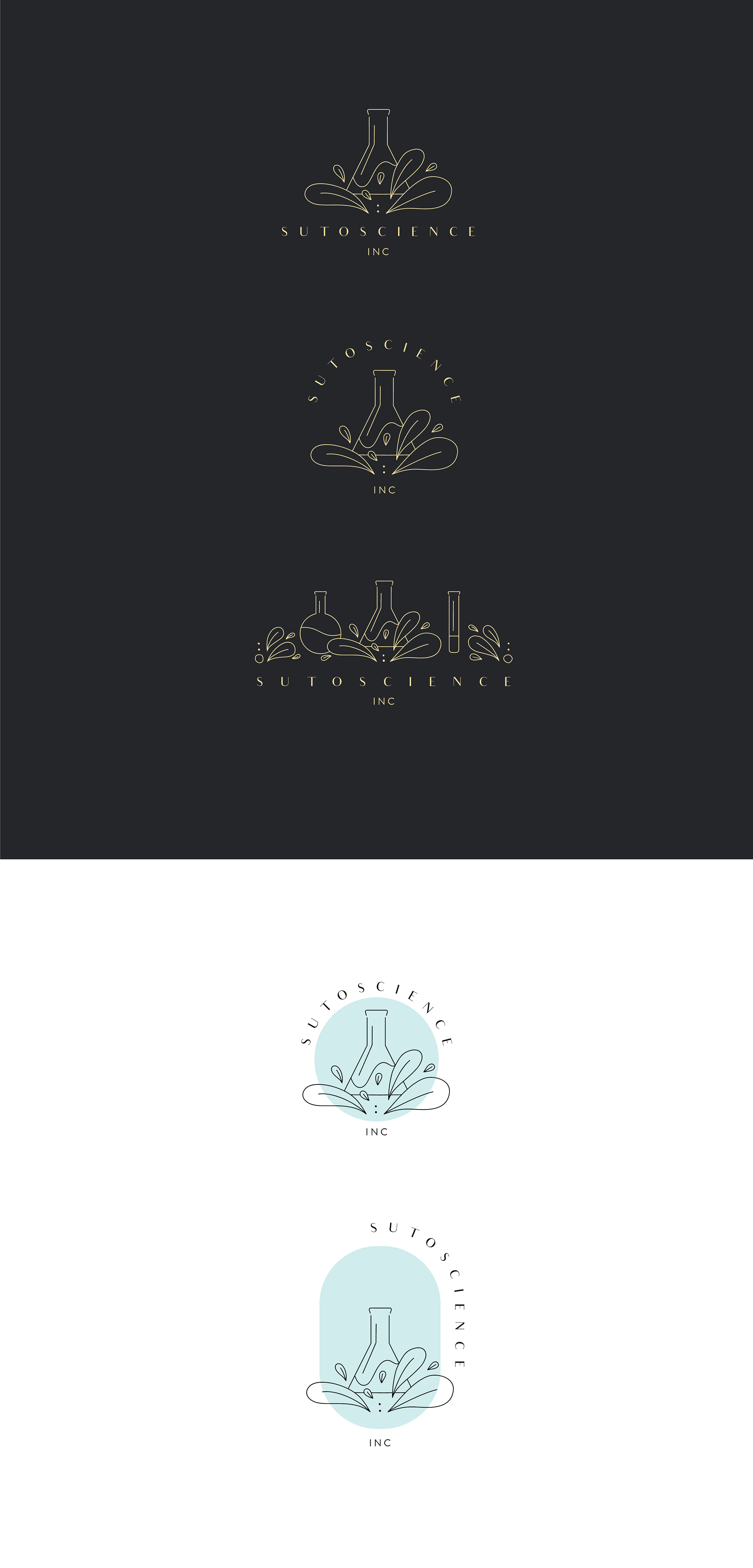
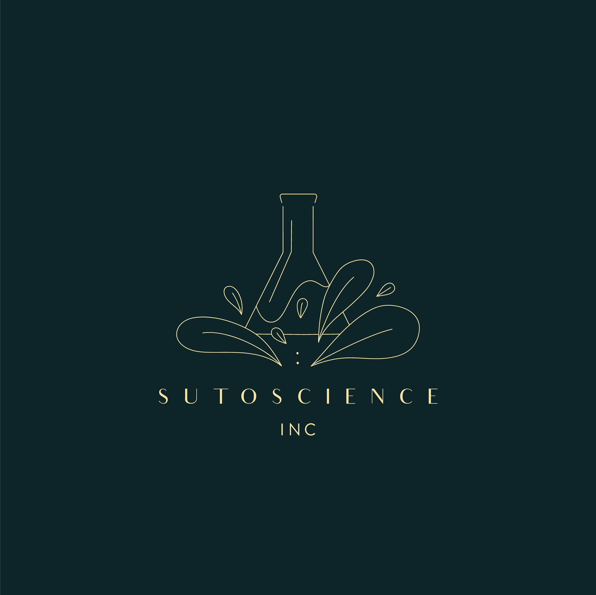
When creating the composition I decided to use reference photos from different shaped beakers to create depth and illustrate the clients' varied services and products. For the flourishes, I decided to create these whimsical tear drop-like leaves, occurring at the base of the beakers themselves. The flourishes appear to be emerging from the beakers, energized and dynamic, to create a sense of excitement and work moving outside of traditional assumptions.
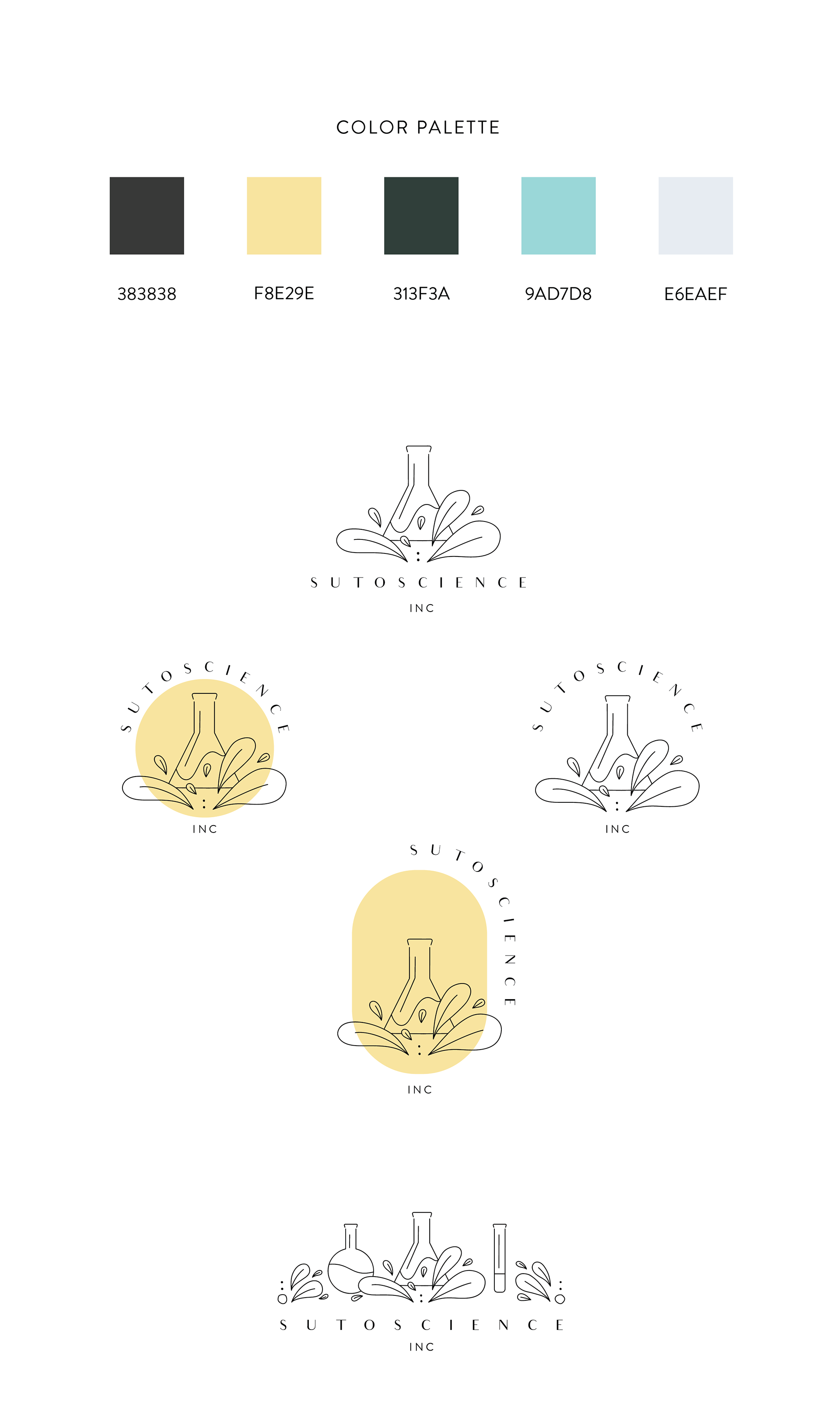
Color Palette & Typography
When you think of colors related to science, you’d probably think of blues and greens first. However, if you’re envisioning the logo design for a writer focused on the science of bringing creative visions to life ...what would that look like? With bright teals, golden yellows, charcoal greys, and dark greens, you evoke connotations of organic work, high-end services, and elegance.
To add visually to the logo’s elegance, I chose a typeface with a modern art deco style. There’s a timeless quality to writing I wanted to bring together when creating the company’s logo and brand guides. United, these different artistic elements communicate a specific sense of style and visual identity.