Intro to Project
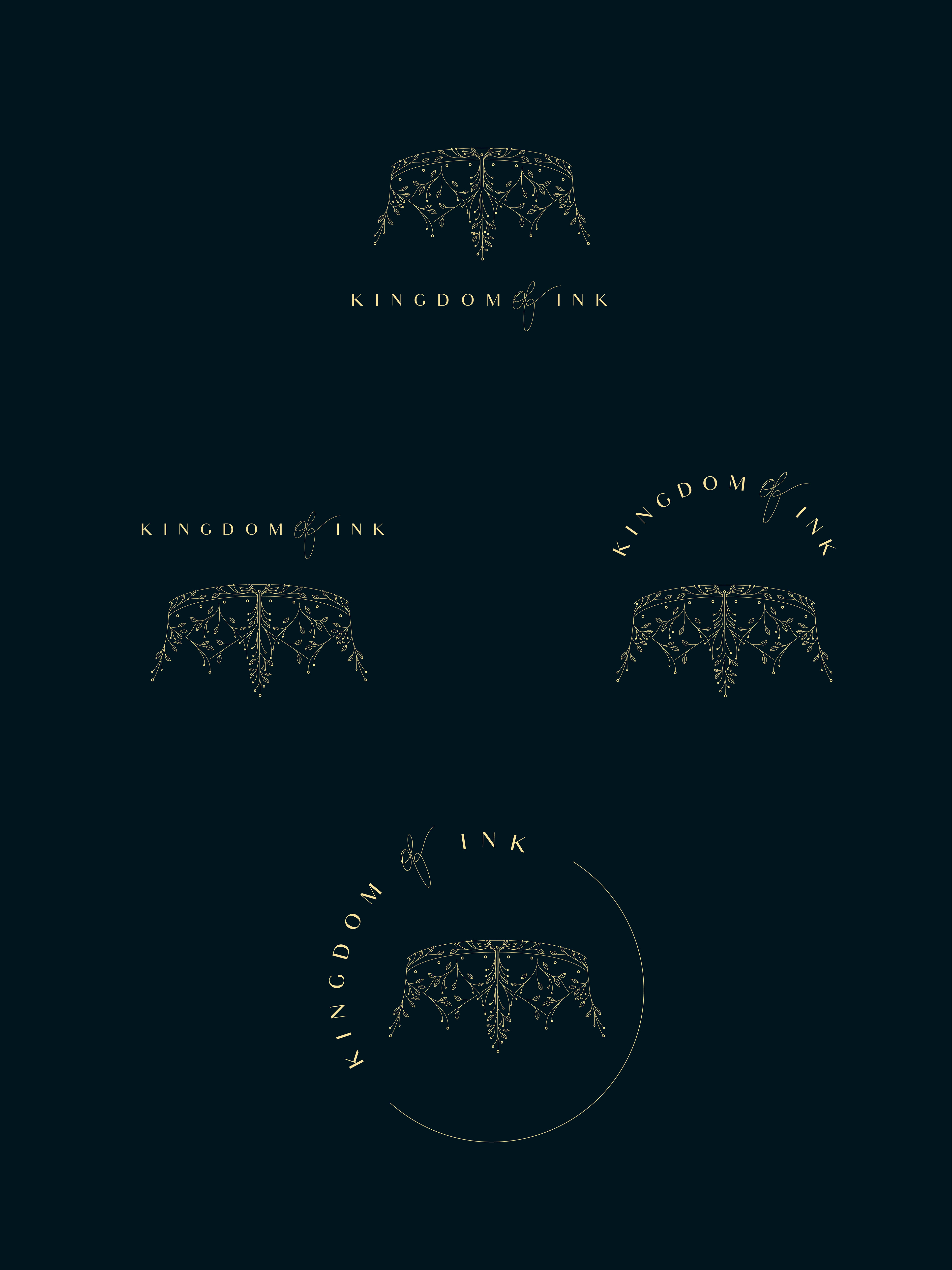
Kingdom of Ink is a freelance writing collective based in Los Angeles. The client had a well-thought-out concept for the design, however, they were unsure how the finished logo would look. They knew they wanted the logomark to be an upside-down crown with a whimsical, elegant, and botanical-inspired aesthetic.
Creating the Composition
When collecting references, I saw several crowns with interwoven segments, reminiscent of tree branches. I collected several images of these crowns and wanted to sketch different iterations of crowns with leaves sprouting from the structure of the crown itself. Writing is often associated with the term “world-building,” with the leaves growing outward, the logomark illustrates a sense of growth coalescing within Kingdom of Ink.
Color Palette & Typography
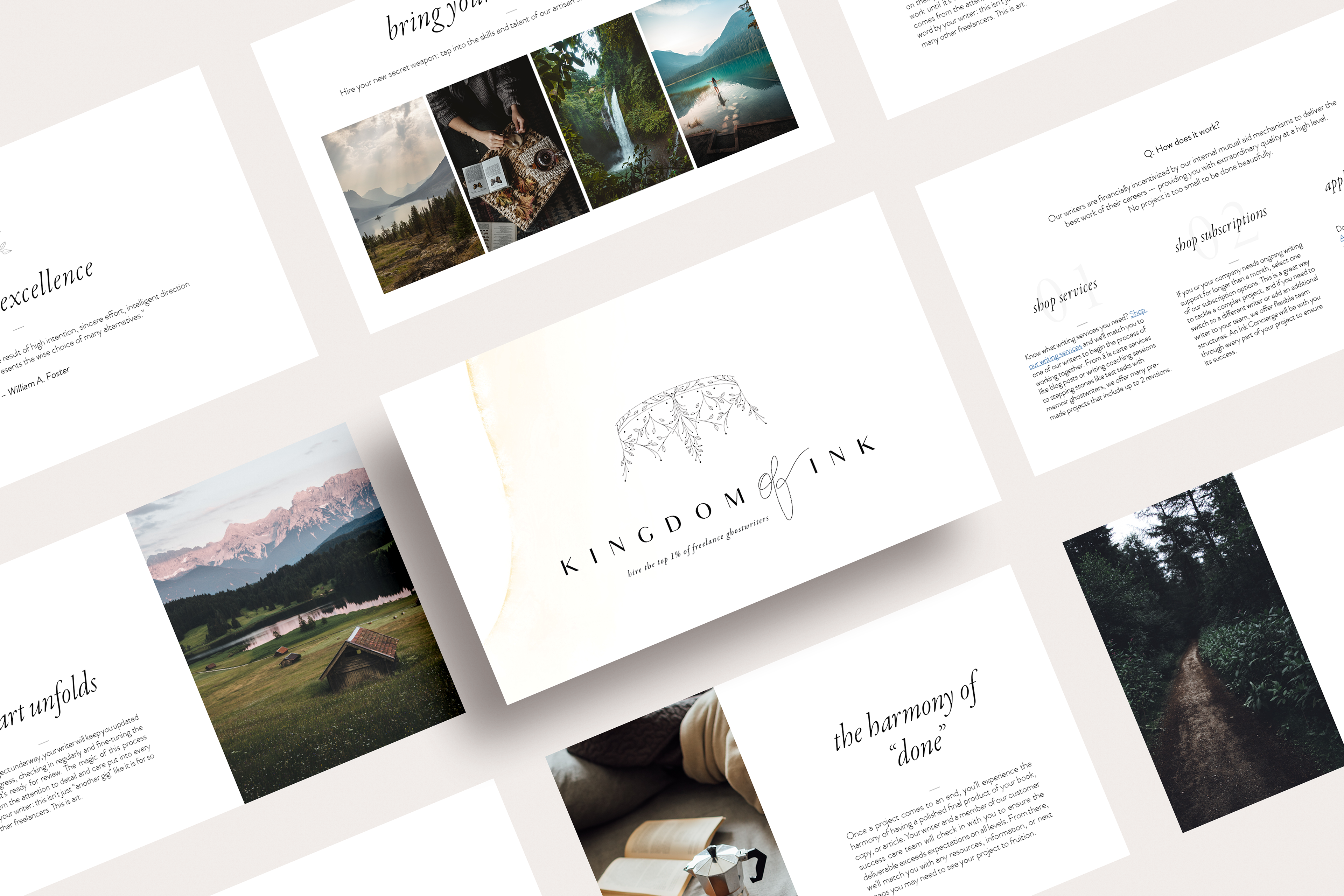
By bringing the botanical concept to life in the logomark, I knew that I wanted the color palette to be inspired by botanicals as well. The muted greens and pale yellows offer a whimsical and woodsy aesthetic, adding a sense of magic to the overall design.