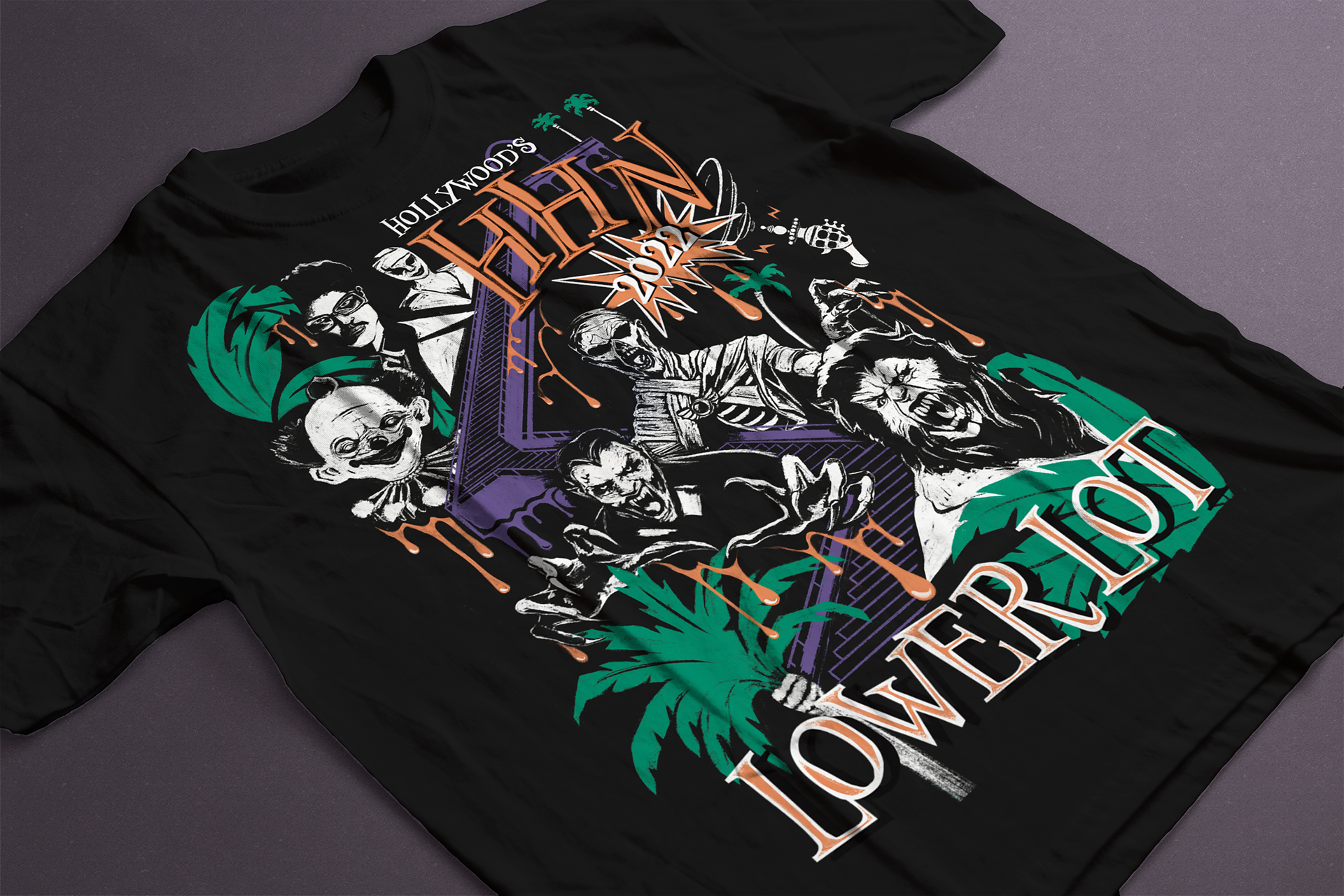
In October of 2022, I was commissioned to design a T-shirt as a morale boost for employees working at Universal Studios’ seasonal event, Halloween Horror Nights. The supervisor who commissioned me wanted a shirt designed specifically for the lower lot. This would include characters from the lower lot mazes such as Killer Klownz, The Weeknd After Hours, and Universal Monsters. In a brief about the project, the client wanted to highlight the characters from each lower lot maze and use no more than four colors in the design to save on printing costs. In a brief about the project, the client wanted to prioritize highlighting the characters from each lower lot maze and using no more than four colors in the design to save on printing costs.
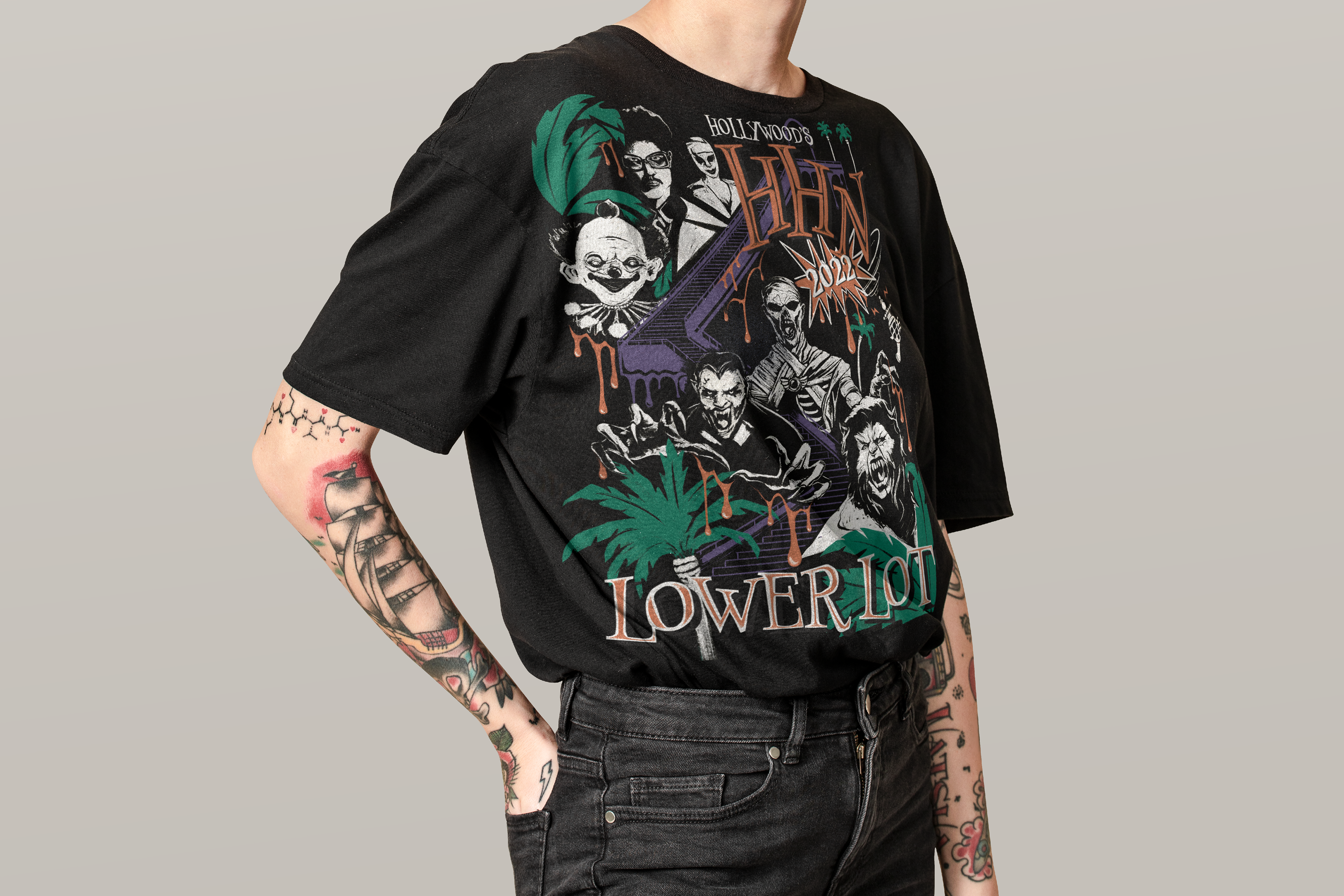
When it comes to representing well-known characters in art, the importance is in the details. I created a mood board with each maze poster side-by-side as a reference for the characters I’d draw. For the overall composition, I wanted to be specific to the event’s location. This isn’t any Universal Studios Park, this is Universal Studios Hollywood. I also wanted this design to encapsulate the level of grittiness typically seen in Halloween/Horror-related apparel, but I wanted to add pops of brighter colors to make the design unique and stand out as a morale boost.
Creating the Composition
With my references and initial ideas in hand, I started sketching out the overall composition for the t-shirt on Procreate. I started with the well-loved characters before filling in any leftover space with palm trees and looming multi-tiered stairs between the upper lot and lower lot of the park. These additions stood out to the client, and they approved the initial composition. Now we were set on the right composition, it was time to explore color and shape.
Developing Atmosphere, Emotion, & Identity
Since the purpose of this shirt was to boost morale for Halloween Horror Nights employees, I wanted the shapes and colors in the design to bring joy. For my colors, I decided to go with light orange, white, purple, and green. I knew the actual shirt would be black, making the light colors pop the most while the heavier saturated colors would be subdued in comparison. For this reason, I chose to make the characters white, the text and details white/orange, and the background elements purple and green. This helped to bring out the characters in contrast to the background elements, creating a sense of depth and focus for the overall design. When drawing the characters themselves, I used rough strokes and line work to add a sense of grittiness resembling 70s band shirts. I wanted to capture the same sense of nostalgia as walking through the Old Hollywood-inspired entrance of the park.
Typography & Final Touches
All that was left was adding in the text. I decided to go with a retro-inspired serif font with high contrast that evoked a sense of playfulness. I customized the text, adding black, orange, or white highlights, to add texture and depth to the letters themselves. At this point, I decided there needed to be more orange in the design to bring the composition together. I added an orange “goop” dripping from the letters and the characters to further the perception that the lower portion of the design was closest to the viewer.
Conclusion
While horror-themed subjects aren't usually within my artistic repertoire, I applied my established creative process to narrate a compelling visual story. Emphasizing both the broader composition and intricate details, I crafted a striking graphic infused with meticulous reasoning behind each design element. This meticulous attention to detail not only enhances the authenticity of the artwork but also evokes a visceral response from those who engage with it. As a morale booster, this design celebrates Halloween Horror Nights as a joyous and spooky event at Universal Studios Hollywood.