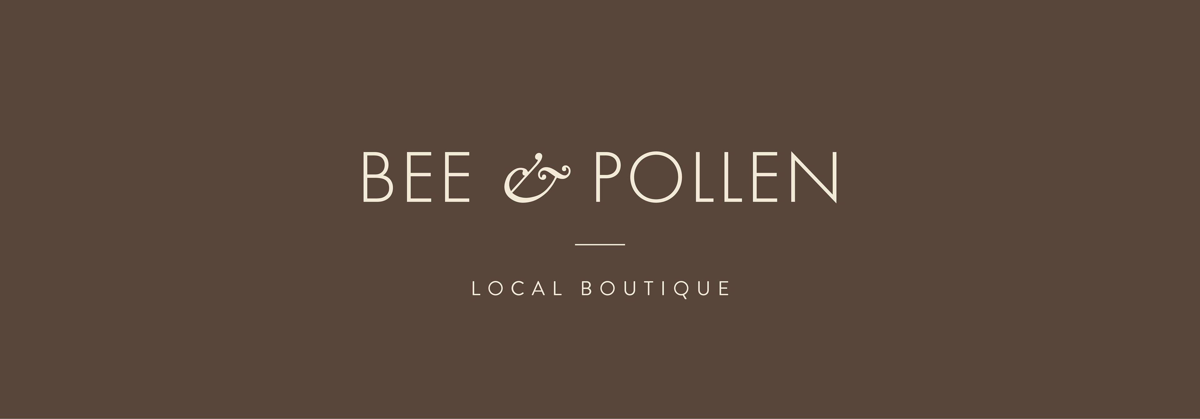
Intro to Project
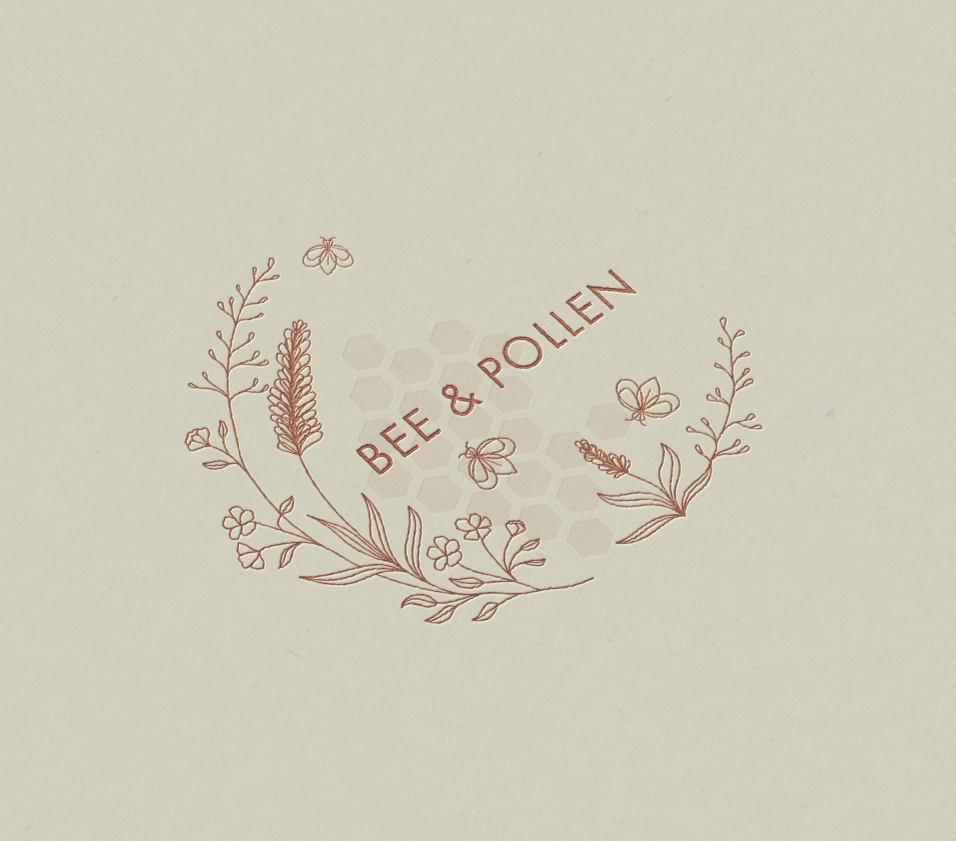
Bee & Pollen is a Denver-based boutique that offers floral design, home goods, and gifts. While working at MadDesigns, I was tasked with creating Bee & Pollen’s logo design & branding guide. From looking at the level of care and artistry in their floral designs, I knew I wanted to make a design that felt hand-drawn and authentic to the simplicity and beauty of their products.
For the composition of the design, I laid out a few basic shapes to follow for the overall logo design. I used these shapes to begin sketching various flowers and plants I saw used in the floral designs of their website. These sketches included a small geometric bee or bee(s) moving between the flowers.

Color Palette
With pale yellows and deep maroons, Bee & Pollen's color palette takes inspiration from the colors used in their floral designs themselves. The colors work beautifully in contrast to one another, simultaneously cohesive to the products.
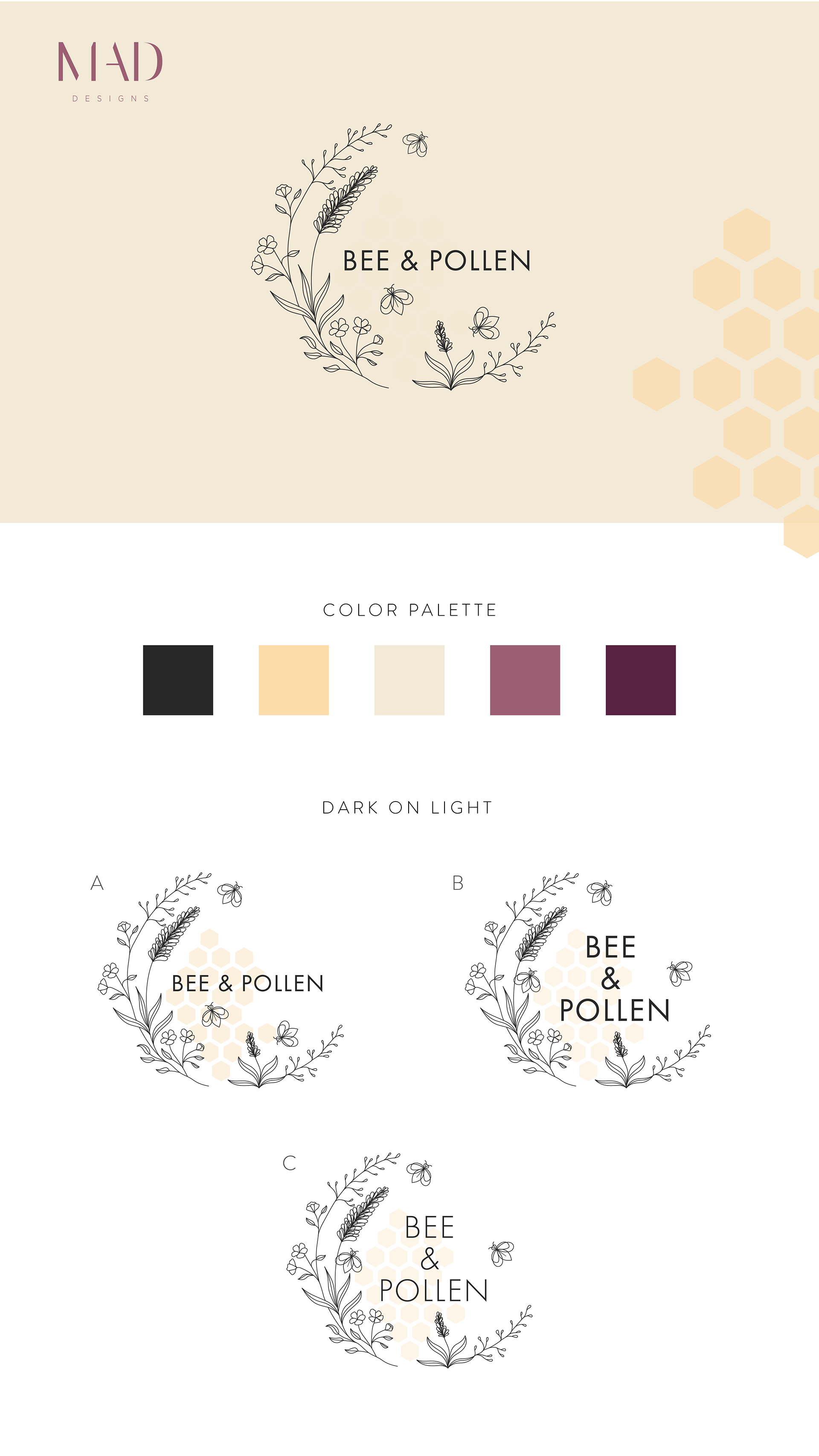
Typography
For the typeface, a simple, geometric sans serif made the most sense, to contrast the thin and maximalist line work in the logo design. The final typeface chosen has varying widths for the characters themselves, adding a sense of whimsical playfulness to the design.